Choosing batik for a modern kebaya is less about finding an exact color match and more about building a clear relationship between two important textiles. The most successful combinations balance undertone, motif scale, visual weight, drape, and the formality of the occasion while allowing both the kebaya and batik to retain their identity.
Start with the kebaya you plan to wear, then assess the batik as it will appear after wrapping or tailoring—not only as an open length of cloth. Look at the visible front panel, border placement, color temperature, and movement. If a selendang or contrasting underlayer is part of the outfit, include it from the beginning rather than treating it as a final addition.
These 11 tips explain how to choose batik for a modern kebaya using the exact outfits shown, from warm sogan-inspired pairings and tonal jewel colors to low-contrast formal styling. Use them as a visual framework, then confirm motif meaning and ceremonial suitability with knowledgeable sources when tradition calls for it.
Use Undertone Harmony, Not Exact Color Matching
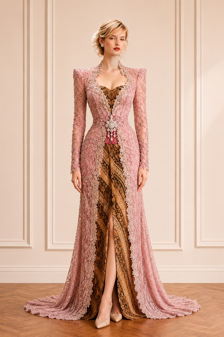
Begin by identifying whether the kebaya reads warm, cool, or neutral. The dusty-pink lace shown here has a muted warmth, so a brown-and-gold batik creates a natural relationship without repeating the pink literally. The deeper batik also gives the pale, intricately embroidered kebaya a grounded base.
Exact matching can make a modern kebaya outfit look flat. Instead, look for a batik with one related undertone or a small accent that echoes the kebaya. Warm blush works beautifully with sogan-inspired brown, caramel, antique gold, and softened black; cooler pinks are often clearer beside charcoal, blue-based burgundy, or silvery taupe.
Styling note: Place the textiles together in daylight. If the kebaya looks brighter but neither fabric makes the other appear dull or yellow, the undertones are likely compatible.
Build a Bridge Color Between the Kebaya and Batik
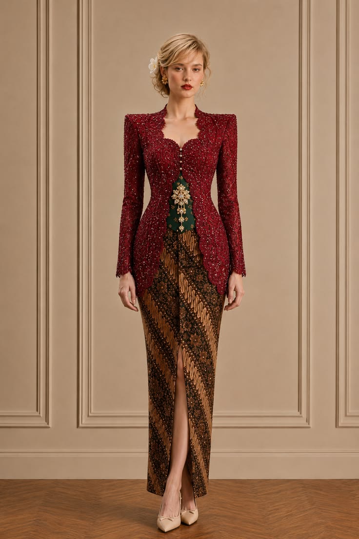
A modern kebaya and batik do not need to share their dominant color. They only need a convincing bridge. In this formal look, the burgundy lace, forest-green inner panel, and brown batik are distinct, but the warm gold notes in the motif, beading, and brooch connect the palette.
To use this method, find the smallest recurring shade in the ensemble and repeat it once or twice. It might appear in the batik border, embroidery thread, buttons, lining, or jewelry. This creates intentional color rhythm while allowing each textile to keep its own character—a useful approach for inherited batik or a kebaya ordered separately.
Styling note: Keep the bridge color secondary. Two or three small repetitions are enough; turning it into another dominant shade can make the palette feel busy.
Balance Warm Batik with a Cool-Toned Kebaya
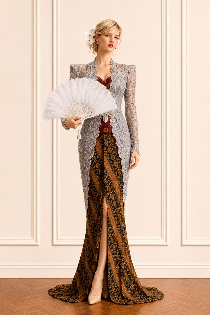
Warm and cool colors can produce a sophisticated pairing when the contrast is deliberate. The silver-gray kebaya in this reference feels luminous against the brown batik, while the burgundy inner panel sits between them visually. It prevents the cool lace and warm lower half from looking disconnected.
When choosing batik for a silver, icy blue, or cool gray kebaya, avoid judging the fabrics in isolation. Look for a brown batik containing black, wine, muted red, or neutral taupe—colors that can mediate the temperature difference. Metallic embroidery can also help, but it should echo an existing batik tone rather than introduce an unrelated shine.
Styling note: Photograph the pairing in natural light and warm indoor light. A balanced warm–cool combination should remain intentional in both settings.
Choose a Tonal Batik for Rich Kebaya Fabrics
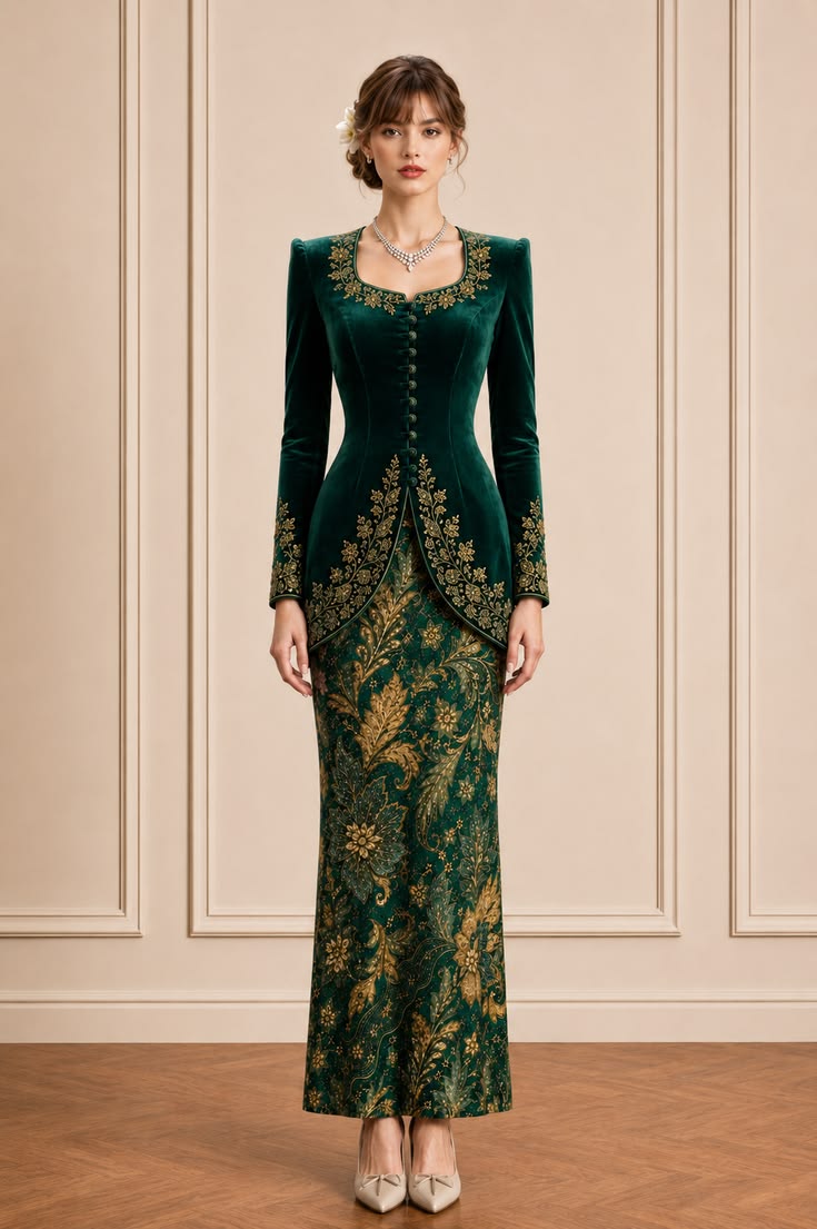
Velvet, dense beadwork, and sculpted tailoring already carry significant visual weight. A tonal batik can support that richness more elegantly than a sharply contrasting print. Here, emerald appears across both pieces, while the batik introduces variation through gold botanical motifs and a slightly lighter green base.
For a tonal pairing, vary texture and motif size rather than adding more colors. A deep velvet kebaya can sit beside silkier batik, crisp cotton, or a subtle metallic weave. The result feels layered instead of uniform. This is especially effective for evening receptions, formal dinners, and ceremonies where a jewel-toned palette suits the setting.
Styling note: Compare the kebaya and batik from several steps away. They should read as one color family, while the border and main motif remain visible.
Keep the Selendang Quiet and Connected
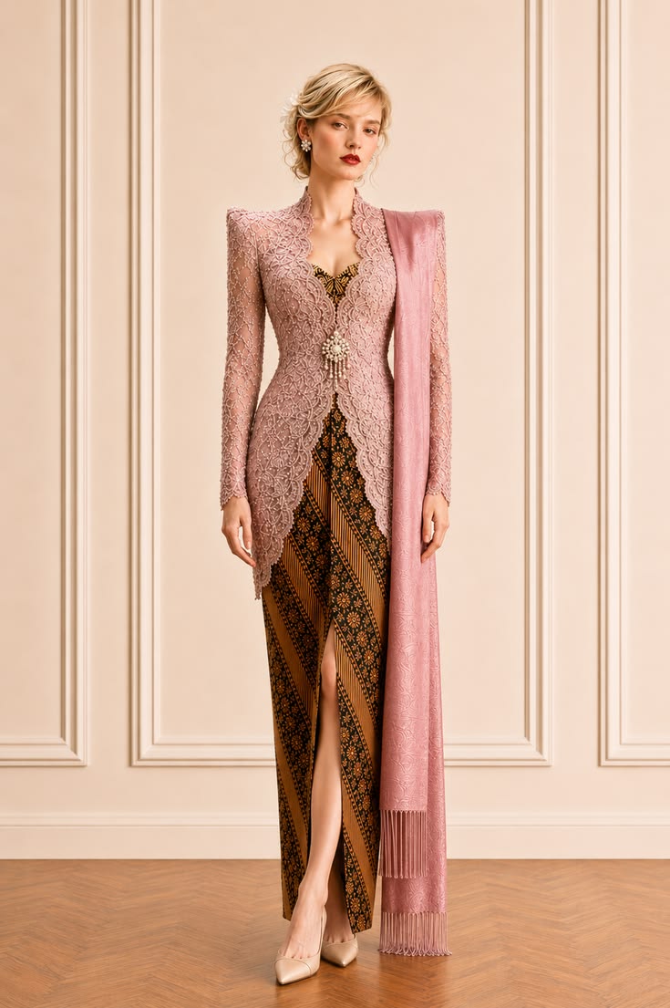
When the outfit includes a selendang, treat it as part of the color structure rather than a separate decoration. The solid dusty-rose selendang shown here repeats the kebaya instead of introducing a third print. That repetition creates a clean vertical line beside the warm, patterned batik.
A solid or subtly woven selendang is often the easiest choice for ornate lace and medium-to-dense batik. If you prefer a patterned version, keep its border related to the batik and check how much pattern will be visible after draping. The selendang should connect the ensemble without covering the kebaya opening, brooch, or most important batik motif.
Styling note: Test the full drape before the final fitting. Photograph it from the front and side to make sure the selendang does not hide the visual balance you created.
Pull One Secondary Color from the Batik
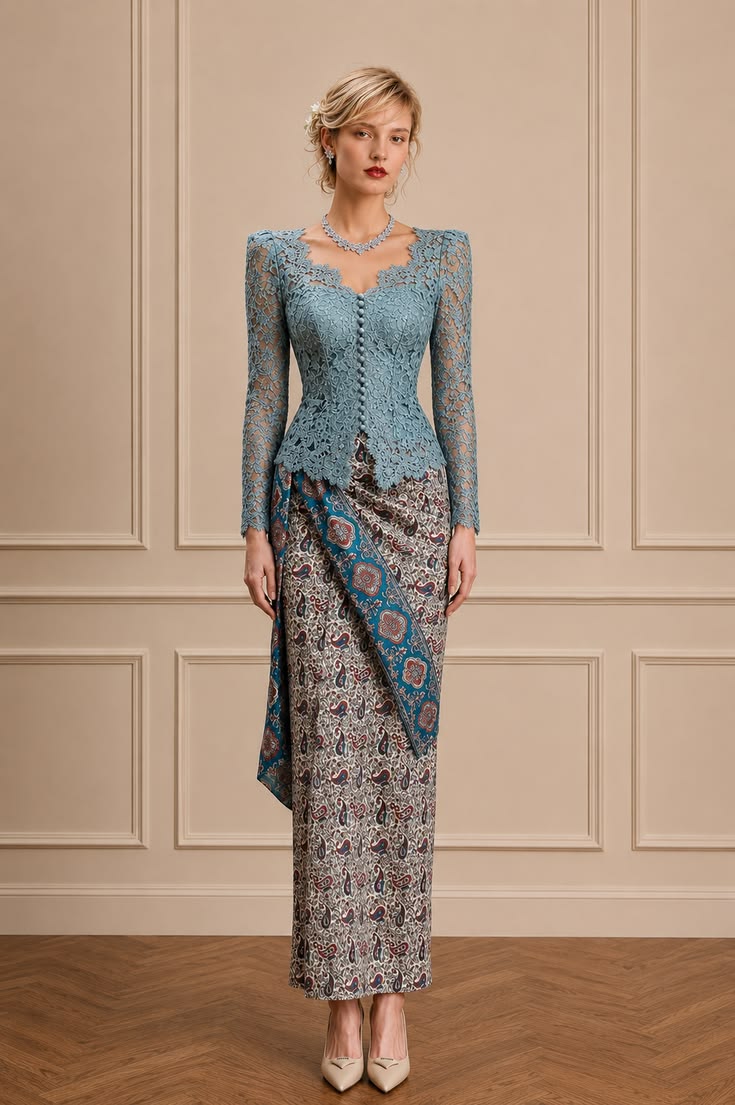
Multicolored batik can work beautifully with a modern kebaya when you select one secondary shade—not necessarily the largest color in the motif—and bring it upward. The powder-blue kebaya here picks up the blue panel and small blue details in the batik, while the ivory, rust, and burgundy remain supporting accents.
This technique is particularly useful when the batik has a neutral ground with several decorative colors. Choose the secondary shade that best suits the event and the finish of the kebaya fabric, then let the remaining colors add depth. Avoid matching the kebaya to every batik color through jewelry, shoes, and a bag; one clear connection is more refined.
Styling note: Fold the batik to show only the section that will appear at the front. Base your color choice on that visible area, not the entire uncut cloth.
Let an Ornate Kebaya Lead with Low-Contrast Batik
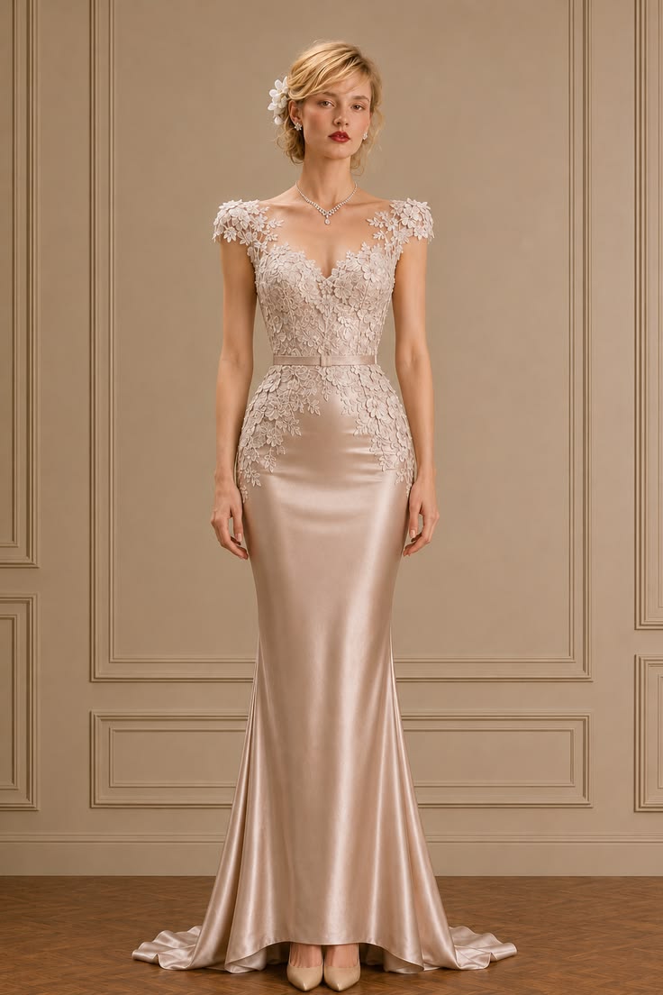
Some kebaya designs need the lower half to recede. The champagne lace and satin reference illustrates that principle: the appliqué, neckline, and fitted silhouette remain the focus because the skirt has almost no color contrast. To translate the effect into a batik pairing, choose a cloth whose ground and motif sit close in value.
Look for ivory-and-taupe, champagne-and-beige, or soft gray-on-pearl batik with a fine repeat rather than a bold border. From a distance, it should read as a calm tonal field; up close, the craftsmanship can still be appreciated. This approach suits an ornate modern kebaya, intimate wedding events, and formal daytime styling.
Styling note: Bring a photo of this low-contrast effect when shopping, but confirm that the final textile is genuine batik and appropriate for the event rather than choosing by color alone.
Match Batik Motif Scale to Lace Density
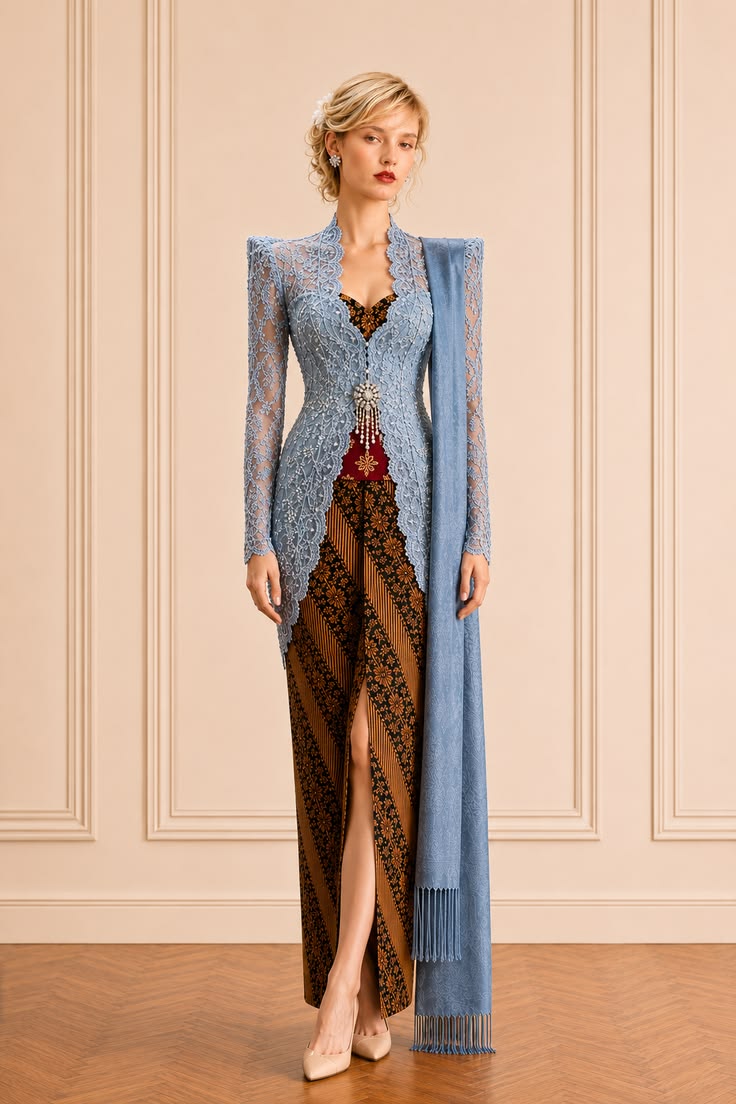
Pattern competition usually happens when the kebaya embroidery and batik motif are equally dense and similar in scale. In this pairing, the blue lace reads as fine surface detail, while the batik has a more legible diagonal rhythm. Each textile can be seen clearly without one dissolving into the other.
If the kebaya is covered in small floral embroidery, try batik with a medium repeat, a strong border, or more breathing room around the motif. If the kebaya is clean and minimally embellished, a denser or larger-scale batik can become the focal point. Scale matters as much as color when creating a balanced modern kebaya ensemble.
Styling note: View the complete look on a phone screen. If both patterns turn into visual noise at thumbnail size, increase the difference in motif scale.
Check Motif Visibility Under a Long Kebaya
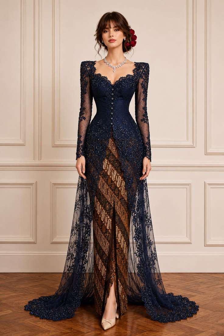
A long kebaya, trailing lace panel, or sheer overlay changes how much batik is actually visible. The navy design shown here covers much of the lower half, so a clear diagonal batik works better than a tiny, low-contrast print that would disappear behind the embroidery.
Before tailoring, pin the batik into its intended wrap or skirt shape and place the finished or basted kebaya over it. Check the front opening, side view, seated position, and back. Important borders should not be cut at an awkward point or hidden completely beneath the train. Intentional placement can make even a small visible section feel significant.
Styling note: Ask the tailor to mark the intended center front and hem before cutting, especially when the batik has a directional motif or statement border.
Use Classic Contrast with a Light Kebaya
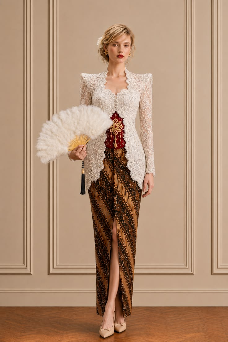
White, ivory, and pearl-toned kebaya can appear especially crisp beside traditional brown batik. The contrast gives the lace edge a clear outline and prevents intricate embroidery from blending into the lower half. Warm brown also softens the brightness of white, creating a formal look that feels grounded rather than stark.
Pay close attention to the white undertone. Creamy ivory is usually harmonious with caramel and golden brown, while optic white may need darker brown, black, or a cooler neutral accent. The underlayer matters too: burgundy, deep red, or another batik-related shade can add depth at the center without overwhelming the restrained palette.
Styling note: Bring the exact underlayer to the fitting. White and sheer lace can change noticeably depending on the fabric and color worn beneath it.
Respect Motif Meaning and Formal Context
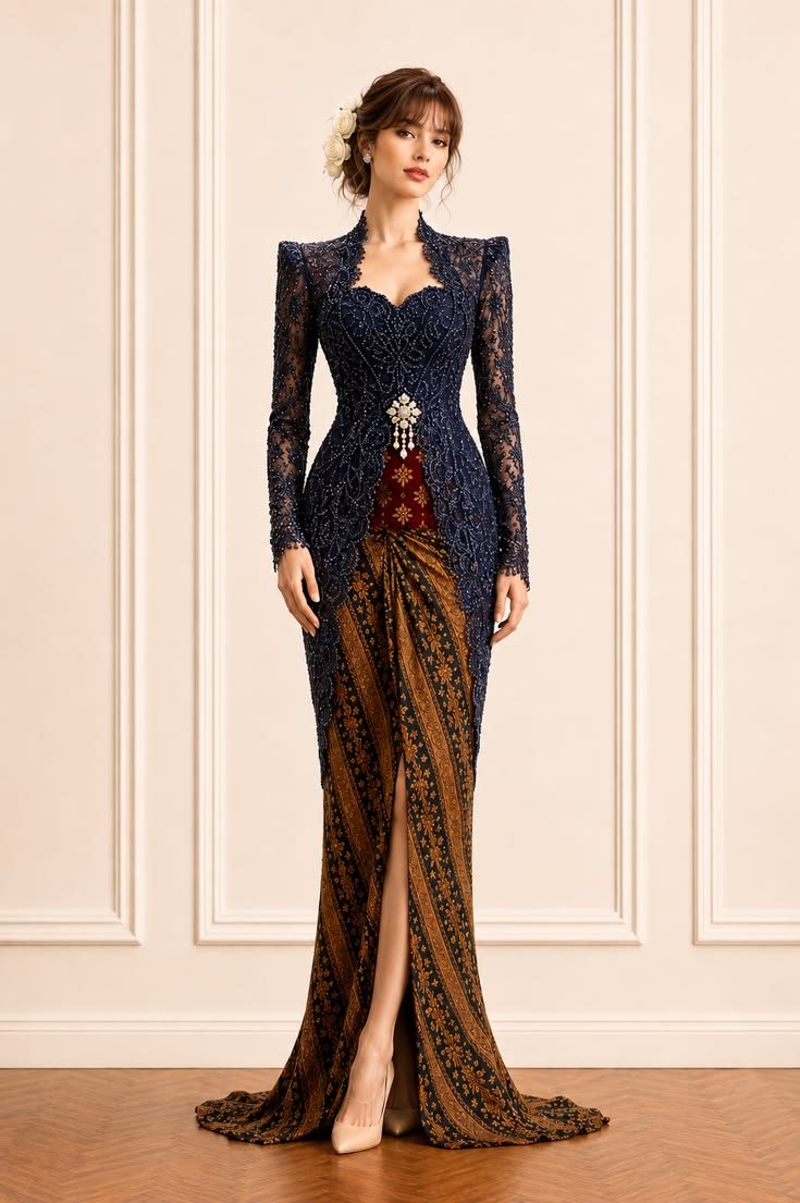
The final decision should go beyond whether the colors look beautiful together. Batik motifs may carry regional, familial, or ceremonial associations, and their appropriate use can depend on the event. For weddings, official occasions, and traditional ceremonies, confirm the motif name and context with a knowledgeable maker, elder, family member, or cultural practitioner.
Then evaluate the practical details of the complete outfit. The navy beaded kebaya and warm brown batik shown here have enough contrast for formal photographs, a clear central opening, and a long vertical line. Your final pairing should also work while walking, sitting, and greeting guests. Respectful context and comfortable construction give modern styling lasting substance.
Styling note: Record the batik’s motif name, origin, maker, and care instructions when you buy it. That information belongs with the garment, not only on the receipt.
Frequently Asked Questions
How to Choose Batik for a Modern Kebaya
Should batik match the kebaya exactly?
No. A coordinated undertone or one shared bridge color is usually more elegant than an exact match. This gives both the kebaya and the batik enough visual space.
How do you balance batik motif scale with kebaya lace?
Pair dense or highly ornate lace with a calmer batik pattern, and let simpler kebaya fabric support a more expressive motif. Checking the full outfit from a distance helps reveal whether the two patterns compete.
What should be considered when choosing batik for a formal event?
Consider the event, regional or family customs, motif meaning, drape, and how much of the pattern remains visible under the kebaya. When in doubt, ask the host or a knowledgeable family member about appropriate motifs.
A Clear Final Edit
Before You Finish the Outfit
- The kebaya and batik share an undertone, bridge color, or intentional contrast.
- One textile leads while the other supports its detail and visual weight.
- The visible batik motif and border sit correctly at the front, side, and hem.
- The selendang, underlayer, jewelry, and shoes reinforce the established palette.
- The complete outfit works for walking, sitting, photographs, and the formality of the occasion.
- The motif’s name, origin, and ceremonial context have been confirmed when relevant.