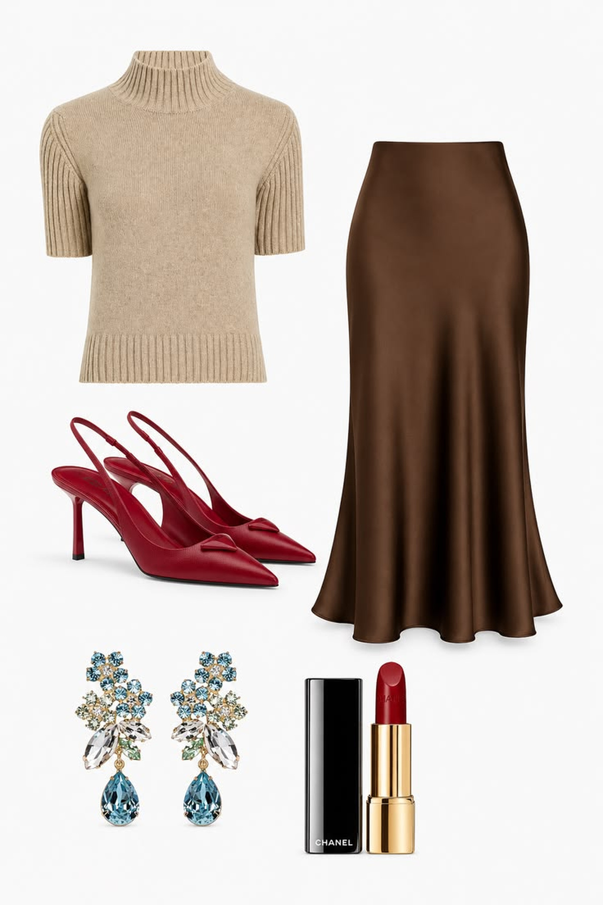
A capsule wardrobe color palette is a practical system for making more outfits from fewer, better-connected pieces. It is not a rule that everything must be beige or monochrome. The strongest palettes combine dependable neutrals with enough supporting color, contrast, texture, and personality to feel recognizably yours.
These twelve tips move from auditing real outfits to choosing core neutrals, bridge shades, patterns, accents, and repeatable formulas. Each visual shows how colors behave inside a complete outfit, because a palette that looks attractive as isolated swatches may feel very different once denim, satin, tweed, leather, and knitwear are involved.
Use the guide as an editing framework rather than a fixed shopping list. Begin with what you already wear, adapt the examples to your climate and routine, and add new pieces only after the colors prove they can create several complete combinations.
Start with the Colors You Already Wear
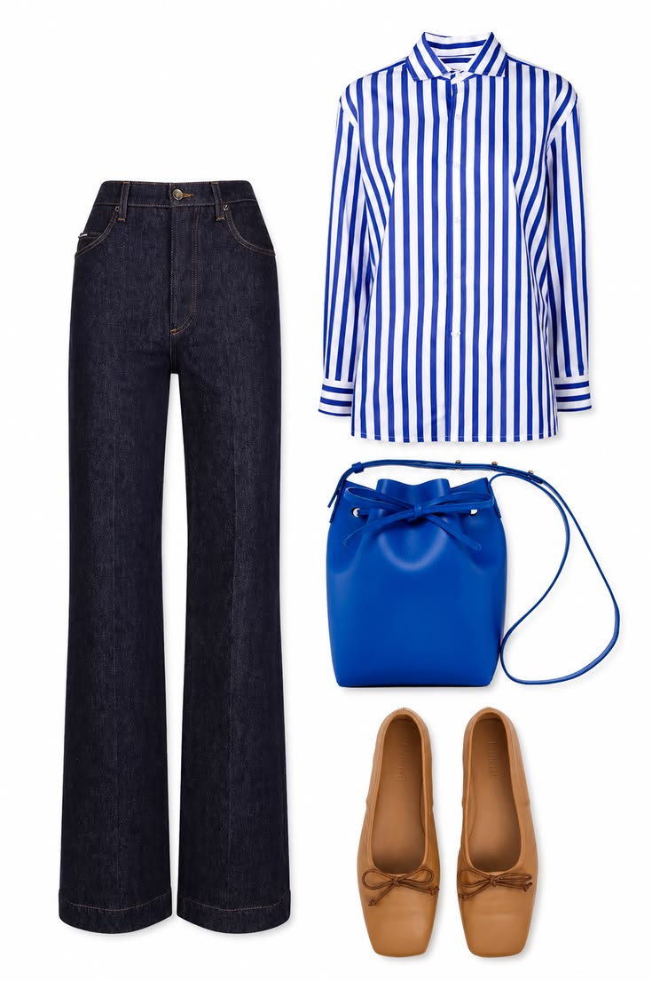
The most reliable capsule wardrobe color palette begins with evidence, not an idealized mood board. Pull out the clothes, shoes, and bags you reach for repeatedly and record the colors that already work together. In this outfit, dark indigo denim and a blue-and-white striped shirt form the familiar base, while cobalt and tan show where stronger color and warmth naturally enter the wardrobe.
Look for repetition across categories. If navy appears in denim, knitwear, jackets, and bags, it may deserve a core role. If tan consistently finishes your blue outfits, it can become a practical leather neutral. Starting with proven combinations makes the final palette easier to wear and prevents a visually appealing plan from becoming disconnected from real life.
Palette note: Photograph five outfits you wore happily in the last month, then circle every color that appears more than once.
Define a Practical Everyday Base
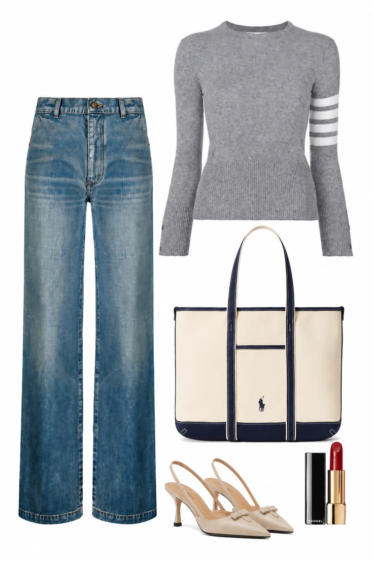
Your palette should serve the settings that occupy most of your week. A practical everyday base may need to move between work, errands, casual meetings, and travel without requiring a separate set of colors for each activity. Grey knitwear, light-wash denim, cream canvas, and navy trim create an adaptable foundation that looks considered but never overly formal.
Notice how the supporting pieces affect usability. Neutral slingbacks keep the outfit polished, while a red lip supplies energy without demanding another large garment. When choosing your own base, consider climate, laundry habits, dress codes, and the colors of the bags and shoes you already own. The best palette reduces friction in the life you actually live.
Palette note: Allocate the largest share of your palette to ordinary weekdays, then add smaller color groups for occasional needs.
Choose Two Core Neutrals That Work Together
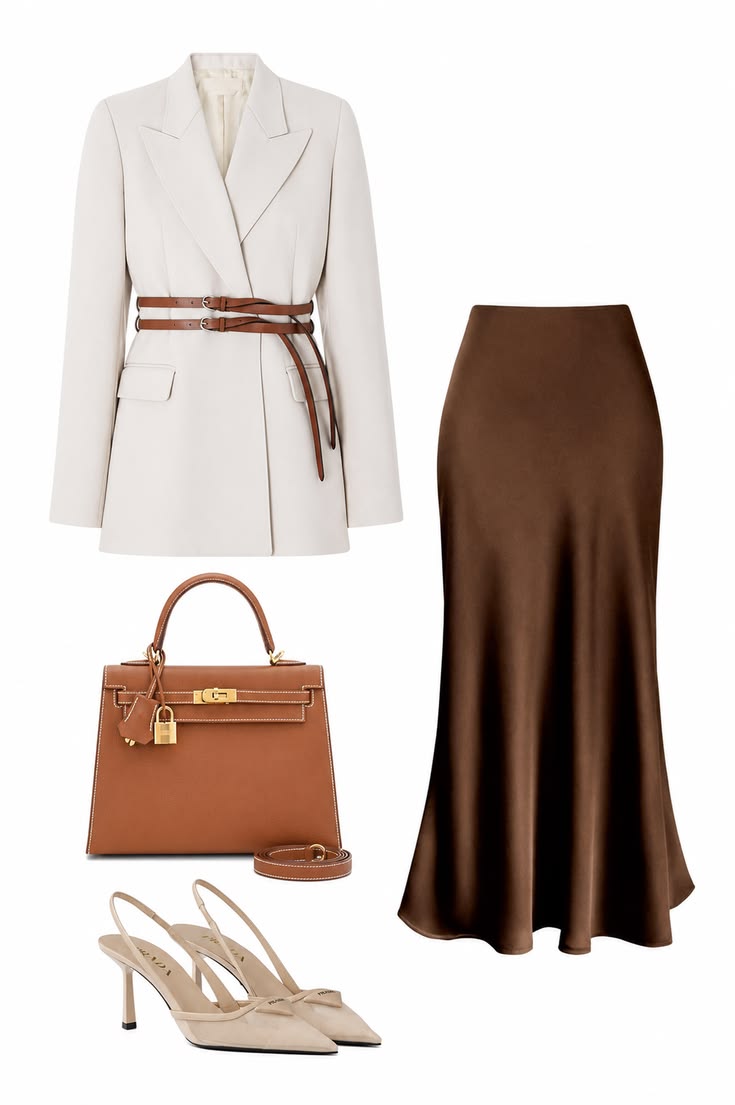
Core neutrals carry the wardrobe pieces with the greatest visual weight: coats, blazers, trousers, skirts, jeans, and larger bags. Choose two that look intentional together rather than selecting each one independently. The ivory blazer and chocolate satin skirt here create a clear light–dark relationship, while the caramel bag acts as a bridge instead of introducing an unrelated third direction.
Strong pairings include navy and cream, charcoal and soft white, black and camel, or chocolate and ivory. One neutral can dominate while the other provides contrast, but both should coordinate with your existing footwear and outerwear. Testing the pair in a complete outfit is more useful than comparing isolated color swatches.
Palette note: Before committing, style your two neutrals with at least one bag and two pairs of shoes you already wear.
Use Bridge Neutrals to Connect Warm and Cool Pieces
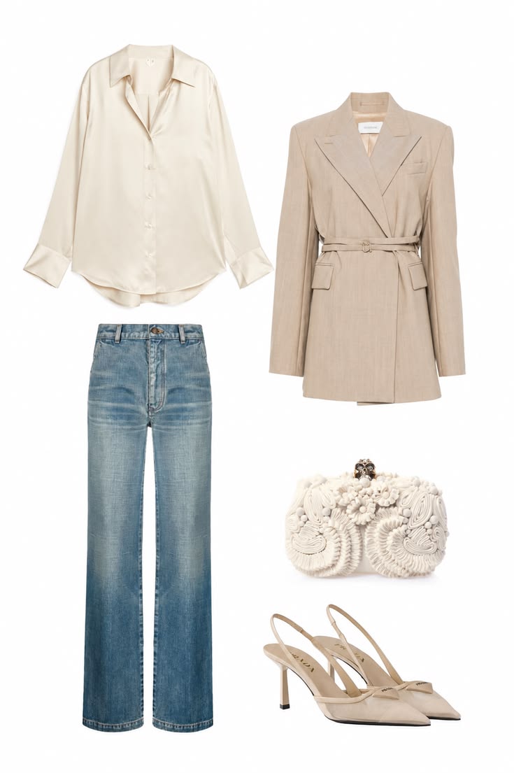
A capsule does not have to be entirely warm or cool. Bridge neutrals such as ivory, stone, taupe, and soft beige can connect blue denim or navy with warmer camel and brown accessories. This outfit uses an ivory satin shirt and beige blazer to soften light-wash jeans, creating harmony even though the pieces do not share exactly the same undertone.
This approach is especially useful when your wardrobe already contains both temperature families. Instead of replacing good pieces, identify one or two connecting shades that sit comfortably beside each group. Repeat those bridge colors in shirts, layers, shoes, or bags so mixed-temperature outfits look deliberate rather than accidental.
Palette note: Place warm and cool favorites side by side in daylight, then test ivory, stone, or taupe between them to find the cleanest bridge.
Select the Right Light Neutral
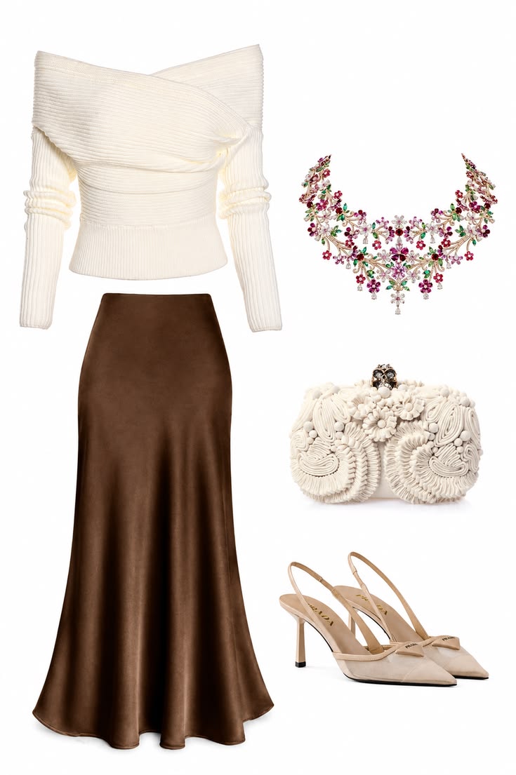
A light neutral brightens the palette and makes dark foundations easier to wear through different seasons. White, ivory, cream, oatmeal, pale grey, and stone each create a different effect. Here, soft ivory blends naturally with chocolate brown, cream accessories, and neutral shoes; an optic white top would create a much sharper, cooler contrast.
Choose the light neutral that works beside your core colors and appears in the fabrics you enjoy wearing. Test it in daylight because subtle yellow, pink, grey, or green undertones become clearer when several pale pieces sit together. The goal is not exact matching, but a family of light shades that layers without looking disconnected.
Palette note: Compare two or three pale options beside your darkest neutral and photograph them in natural light before deciding.
Choose Accent Colors You Can Repeat
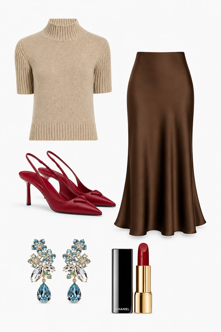
Accent colors give a capsule personality, but they are most useful when they can reappear in more than one form. Red shoes and lipstick create a confident thread through this taupe-and-chocolate outfit, while blue crystal earrings add a smaller contrasting note. Because the base remains restrained, the accents feel intentional rather than competitive.
Choose one main accent you enjoy enough to repeat in accessories, a print, knitwear, or beauty details. A second accent can be smaller and more occasional. Cobalt, burgundy, emerald, or red may look striking on a palette chart, but a color earns its place only when you are willing to wear it with several existing outfits.
Palette note: Test an accent in three scales—small jewelry, a shoe or bag, and one garment—to learn how much color feels natural to you.
Test Each Color Across Different Materials
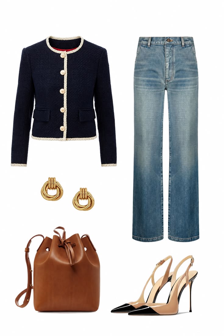
The same named color can shift significantly across tweed, denim, satin, leather, cotton, and knitwear. Navy tweed appears deep and textured, while washed blue denim is softer and more casual. Cognac leather adds warmth, and glossy black shoe caps introduce a sharper finish. A successful palette accounts for these material differences instead of expecting every shade to match exactly.
Lay garments together in daylight and compare both undertone and surface. Slight variation usually creates useful depth, especially within blue or brown families, but two nearly matching shades can clash when one turns green and the other purple. Material testing also helps a simple palette feel layered rather than flat.
Palette note: Keep clear phone photos of difficult-to-match pieces so you can compare undertones when shopping away from home.
Use Patterns to Link Your Palette
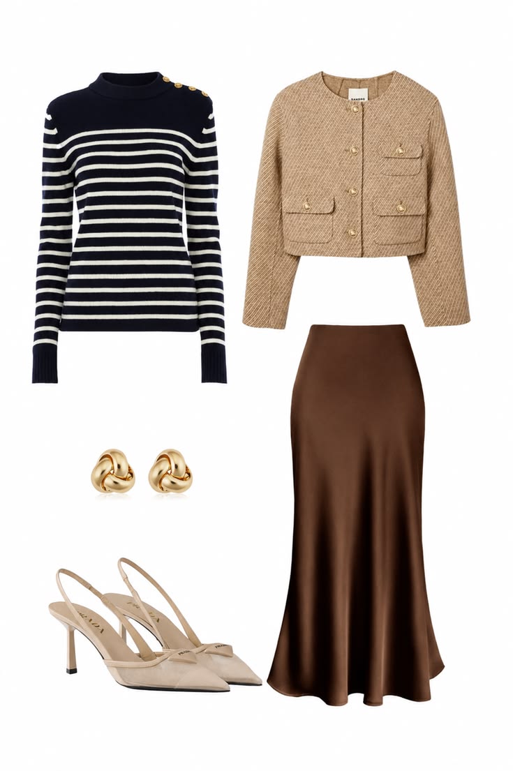
Patterns can act as a map for the whole capsule. The navy-and-ivory stripe in this outfit introduces two established colors, then a beige jacket and chocolate skirt extend the neutral range. Because the print repeats colors already present elsewhere, it adds movement without making the wardrobe harder to coordinate.
Stripes, checks, small florals, and subtle prints are easiest to integrate when at least two of their colors belong to your core palette. Treat the remaining shade as a possible accent rather than a new category. This keeps patterned pieces connected to solid trousers, skirts, knitwear, and layers you already own.
Palette note: Before buying a print, name three solid pieces in your wardrobe that match colors already inside it.
Set Your Preferred Level of Contrast
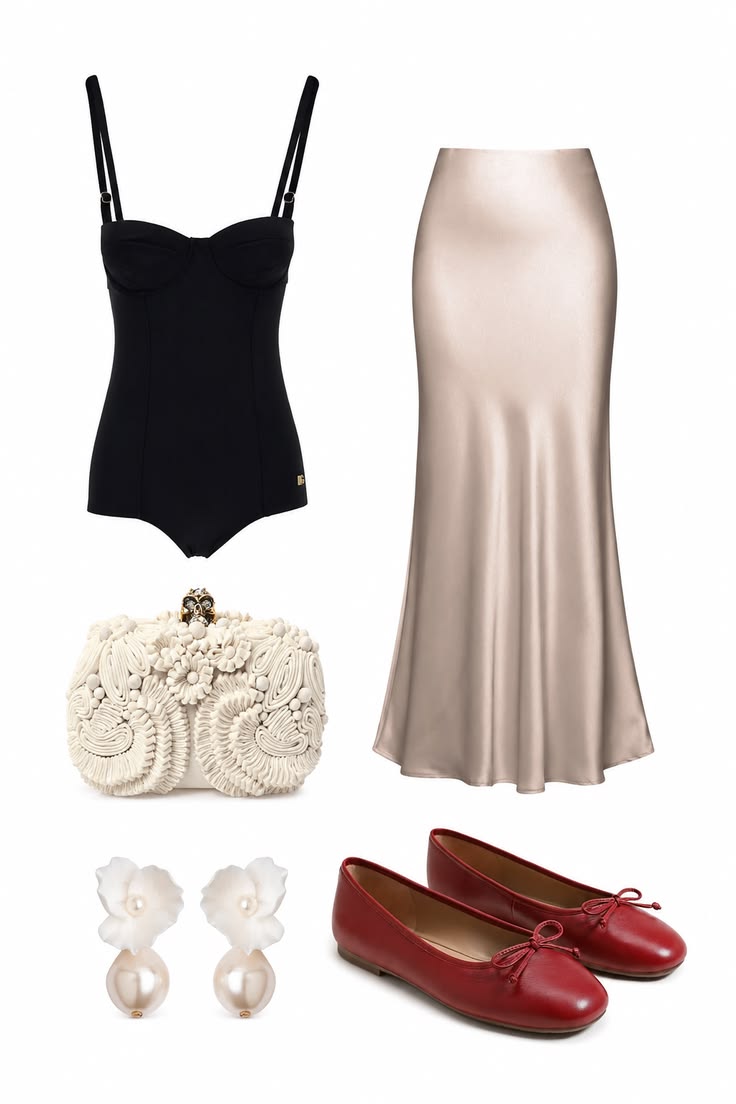
Contrast determines whether a palette feels graphic, soft, or tonal. The black top and champagne satin skirt create a strong light–dark division, while the ivory clutch and pearl earrings soften the transition. Red ballet flats bring one saturated accent without changing the essential structure of the outfit.
Review the outfits you feel best wearing and notice whether they rely on crisp separation or closely related shades. You can use both, but choosing a dominant contrast level makes purchases more consistent. Accessories are the easiest way to increase or soften contrast without rebuilding the wardrobe.
Palette note: Create one high-contrast outfit and one tonal outfit from your closet, then compare which one feels easier to repeat.
Make the Palette Flexible Across Seasons
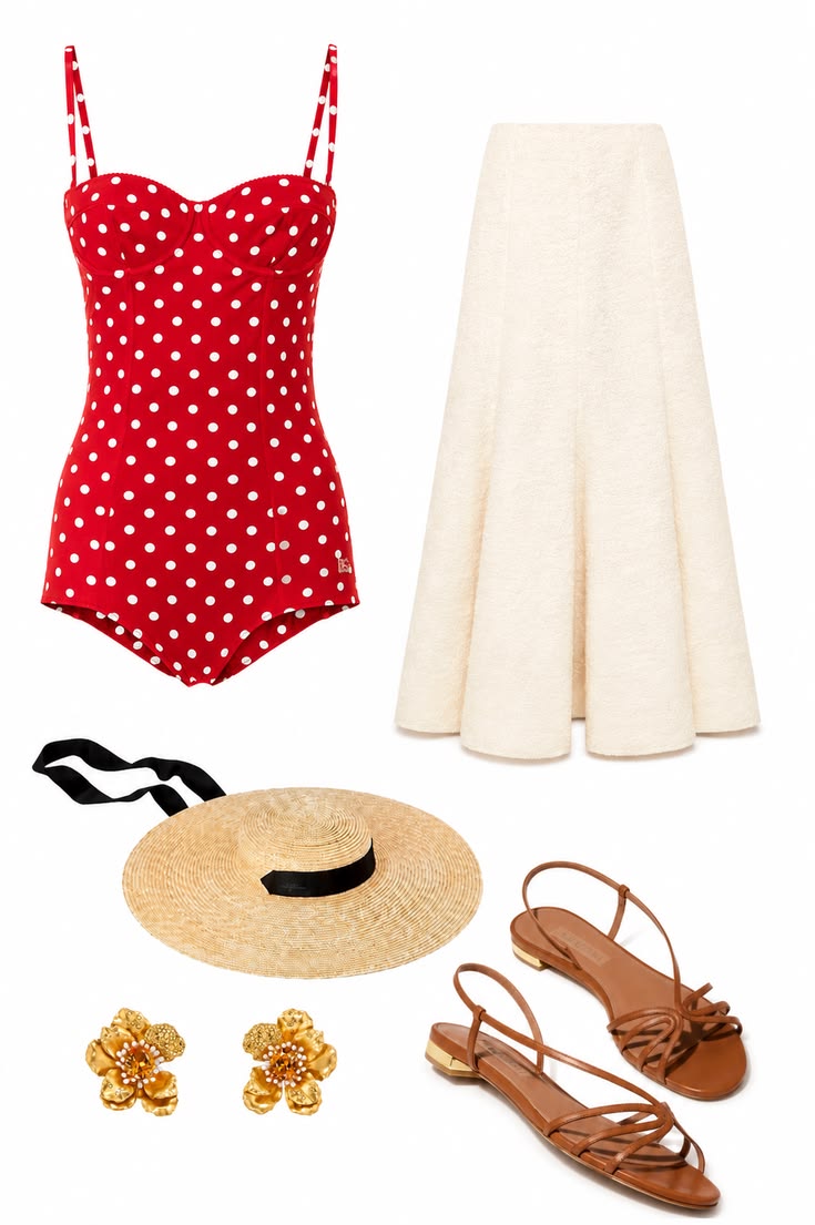
Seasonal flexibility comes from changing fabric weight and proportion before introducing an entirely new set of colors. This warm-weather outfit uses red, ivory, tan, and gold—the same accent-and-neutral logic that can appear later in knitwear, a trench, leather shoes, or a structured bag. The palette remains recognizable even though the materials become lighter.
Check whether your darkest neutral, light neutral, and main accent each have a realistic role in warm and cool conditions. Not every shade needs equal representation in every season. The objective is continuity: summer pieces should still coordinate with transitional layers, bags, and shoes rather than forming an isolated mini wardrobe.
Palette note: List one warm-weather and one cool-weather fabric for every major color before adding seasonal pieces.
Prove the Palette with Repeatable Outfit Formulas
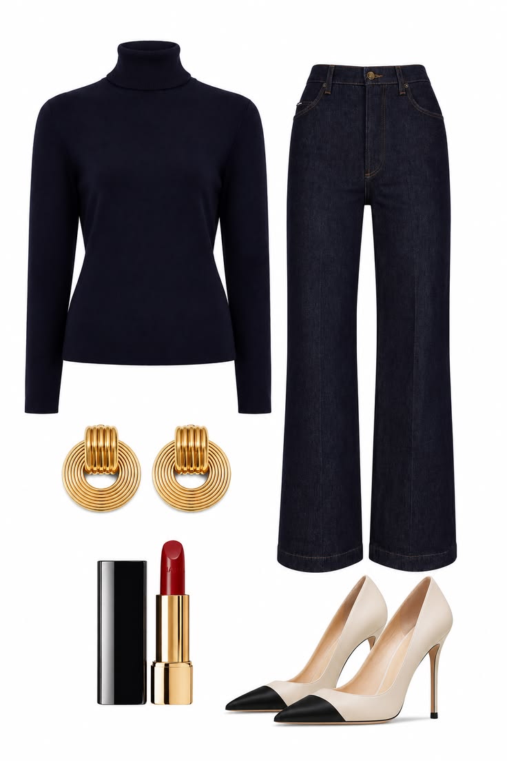
A palette is useful only when it produces complete outfits. Build at least five repeatable formulas using a top, bottom, layer, shoe, and optional accent. The navy turtleneck and dark indigo jeans here form a tonal column; gold earrings, cap-toe pumps, and red lipstick change the finish without weakening the dependable base.
Repeat the test with different levels of formality and make sure key pieces participate in more than one combination. A navy knit might work with dark denim, an ivory skirt, and camel trousers. If a color appears only in one isolated matching set, it may belong in a smaller accent role rather than at the center of the capsule.
Palette note: A major palette color should appear in at least three successful outfits using pieces you already own.
Document the Palette and Set Shopping Rules
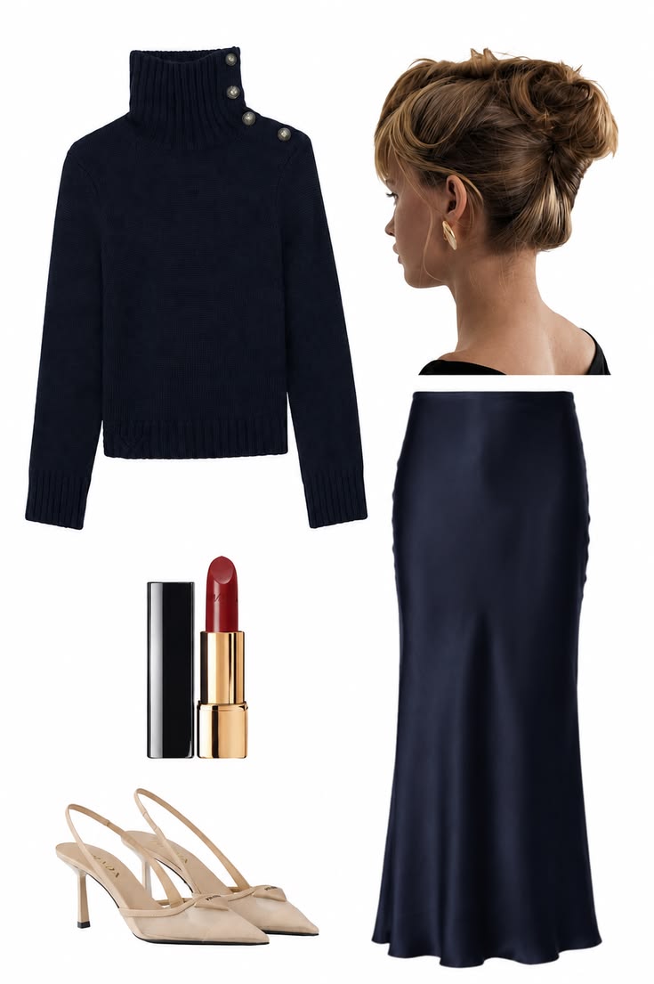
Once your combinations work, document the final system in concrete terms. This outfit makes the hierarchy easy to read: navy is the dominant core color across the knit and satin skirt, nude is the practical leather neutral, gold is the chosen metal finish, and red appears as a small, high-impact accent. Recording each color by role is more useful than saving an attractive group of swatches with no plan for how to wear them.
Turn the palette into shopping rules that protect that hierarchy. A new item should coordinate with at least three existing pieces, fill a genuine wardrobe gap, and support a repeatable outfit formula. Review the system once or twice a year rather than changing it with every trend; the goal is a clear framework that can evolve without losing the connections that make the capsule efficient.
Palette note: Final formula: navy core + nude leather + gold metal + optional red accent. Write your own version in one line before making a new purchase.
Frequently Asked Questions
How to Choose a Capsule Wardrobe Color Palette
How many colors should a capsule wardrobe palette have?
A practical starting point is two core neutrals, one light neutral, one or two supporting colors, and one accent. The exact number matters less than making sure the colors create several complete outfits.
What are the best neutral colors for a capsule wardrobe?
Navy, black, charcoal, chocolate, camel, cream, ivory, grey, and dark denim can all work. Choose neutrals that suit your existing wardrobe, lifestyle, climate, and preferred contrast.
Can a capsule wardrobe include bright colors and prints?
Yes. Bright accents and prints belong in a capsule when they repeat established palette colors and coordinate with several core pieces.
Do all capsule wardrobe colors need the same undertone?
No. Bridge neutrals such as ivory, stone, taupe, or soft beige can connect warm and cool pieces. Test the combination in daylight and across the materials you actually wear.
How do I know whether my capsule color palette works?
Build at least five outfit formulas using your proposed colors. If major pieces combine easily across work, casual, and seasonal needs, the palette is functioning well.
A Clear Final Edit
Before You Finish the Outfit
- Two core neutrals coordinate across outerwear, bottoms, bags, and shoes.
- One light or bridge neutral connects the warm and cool sides of the wardrobe.
- Supporting colors appear in several complete outfit formulas.
- The main accent feels enjoyable enough to repeat in different scales.
- Patterns and textures reuse colors already established in the palette.
- Every proposed purchase works with at least three pieces you own.